Descriptive Statistics
A subset of statistics called descriptive statistics is concerned with gathering, analyzing, and presenting data in a concise or descriptive way. Its major objective is to outline or summarize a dataset key characteristics, including central tendency, variability, and form.
In other words, by summarizing the main features of a big amount of data, descriptive statistics help us make sense of it. It enables us to spot trends, patterns, and connections between variables, as well as to explain these discoveries effectively.
Analyzing a class of students’ grades serves as a practical illustration of descriptive statistics. In order to depict the central tendency of the data and the diversity of the grades, respectively, we might compute the average grade and standard deviation. To see the range of grades and spot any outlier, we could also make a histogram or a box plot. We can learn more about how the class is doing generally and pinpoint areas where some students may be struggling or doing particularly well by using descriptive statistics.
Bar Charts
A bar chart, also known as a bar graph, is a type of chart that displays categorical data using rectangular bars. The height or length of each bar corresponds to the value of the category being represented. Bar charts are used to compare different categories and to display changes over time.
There are several types of bar charts, including:
Vertical Bar Chart: In a vertical bar chart, the categories are plotted along the x-axis, and the values are plotted along the y-axis. Each bar represents a different category, and its height corresponds to the value being represented.
Horizontal Bar Chart: In a horizontal bar chart, the categories are plotted along the y-axis, and the values are plotted along the x-axis. Each bar represents a different category, and its length corresponds to the value being represented.
Stacked Bar Chart (a.k.a. Component Bar Chart): In a stacked bar chart, the bars are divided into segments to represent different sub-categories. Each segment corresponds to a value, and the height or length of each segment represents the value being represented. Stacked bar charts are useful for comparing the relative sizes of different sub-categories within each category.
Grouped Bar Chart (a.k.a. Cluster or Multiple Bar Chart): In a grouped bar chart, the bars are grouped together to compare the values of different categories side-by-side. Each group of bars represents a different category, and the height or length of each bar within the group represents the value being represented.
Overall, bar charts are a useful tool for visualizing and comparing categorical data, and they can be customized to display different types of information depending on the needs of the user.
Vertical Bar Chart
Here’s an example of a vertical bar chart using the “mtcars” dataset in R. This dataset contains information on various car models, including their miles per gallon (mpg) and number of cylinders.
To create a vertical bar chart of the average mpg for each number of cylinders, we can use the following code:
# Load the mtcars dataset
data(mtcars)

# Calculate the average mpg for each number of cylinders
mpg_by_cyl <- aggregate(mpg ~ cyl, mtcars, mean)

# Create a vertical bar chart using the ggplot2 package

chart1 <- ggplot(mpg_by_cyl, aes(x = cyl, y = mpg)) +
  geom_bar(stat = "identity", fill = "steelblue") +
  theme_ipsum() +
  theme(
    panel.grid.minor.y = element_blank(),
    panel.grid.major.y = element_blank(),
    legend.position="none"
  ) +
  labs(x = "Number of Cylinders",
       y = "Average MPG",
       title = "Average MPG by Number of Cylinders")
This will produce a vertical bar chart that looks like this:
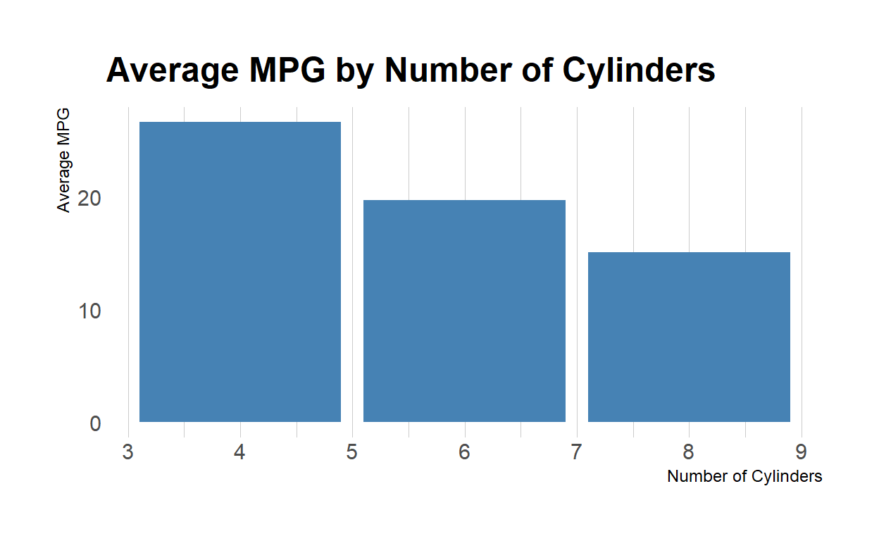
In this chart, each bar represents a different number of cylinders, and its height corresponds to the average mpg for that number of cylinders. The x-axis shows the number of cylinders, and the y-axis shows the average mpg. We can see from the chart that cars with fewer cylinders tend to have higher mpg, while cars with more cylinders tend to have lower mpg.
Horizontal Bar Chart
Sure, here’s an example of a horizontal bar chart using the “diamonds” dataset in R. This dataset contains information on various diamonds, including their carat weight, cut, and price.
To create a horizontal bar chart of the average price for each cut of diamond, we can use the following code:
# Load the diamonds dataset
data(diamonds)

# Calculate the average price for each cut of diamond
price_by_cut <- aggregate(price ~ cut, diamonds, mean)

# Create a horizontal bar chart using the ggplot2 package

chart2 <- ggplot(price_by_cut, aes(x = price, y = cut)) +
  geom_bar(stat = "identity", fill = "steelblue") +
  coord_flip() +
  theme_ipsum() +
  theme(
    panel.grid.minor.y = element_blank(),
    panel.grid.major.y = element_blank(),
    legend.position="none"
  ) +
  labs(x = "Average Price", y = "Diamond Cut",
       title = "Average Price by Diamond Cut")
This will produce a horizontal bar chart that looks like this:

In this chart, each bar represents a different cut of diamond, and its length corresponds to the average price for that cut. The y-axis shows the diamond cut, and the x-axis shows the average price. We can see from the chart that the highest average prices are for diamonds with a “Fair” or “Very Good” cut, while the lowest average prices are for diamonds with a “Good” or “Ideal” cut. The coord_flip() function is used to flip the axes and make the chart horizontal.
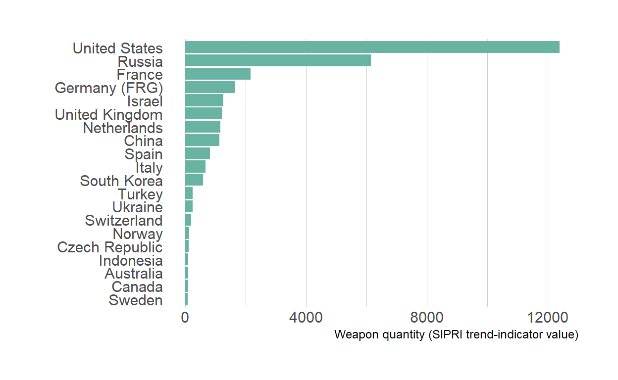
Here is another example showing the quantity of weapons exported by the top 20 largest exporters in 2017.
Component Bar Chart
Here’s an example of a component bar chart using the “mpg” dataset in R. This dataset contains information on various car models, including their miles per gallon (mpg), number of cylinders, and number of gears.
To create a component bar chart of the average mpg for each combination of cylinders and gears, we can use the following code:
# Load the mtcars dataset
data(mtcars)

# Calculate the average miles per gallon (mpg) for each number of cylinders
avg_mpg <- aggregate(mpg ~ cyl, mtcars, mean)

# Calculate the average horsepower for each number of cylinders
avg_hp <- aggregate(hp ~ cyl, mtcars, mean)

# Combine the two datasets into one using the "merge" function
merged_data <- merge(avg_mpg, avg_hp, by = "cyl")

# Melt the data into a format suitable for creating a component bar chart
melted_data <- melt(merged_data, id.vars = "cyl")

# Create a component bar chart using the ggplot2 package
chart3 <- ggplot(melted_data, aes(x = factor(cyl),
                                  y = value,
                                  fill = variable)) +
  geom_bar(stat = "identity", position = "stack") +
  theme_ipsum() +
  theme(
    panel.grid.minor.y = element_blank(),
    panel.grid.major.y = element_blank(),
    legend.position="none"
  ) +
  labs(x = "Number of Cylinders",
       y = "Average Value",
       title = "Average MPG and Horsepower",
       subtitle = "by Number of Cylinders") +
  scale_fill_manual(values = c("steelblue", "darkred"),
                    name = "Variable",
                    labels = c("MPG", "Horsepower"))
This will produce a component bar chart that looks like this:

In this chart, each bar represents a different number of cylinders (4, 6, or 8), and is divided into two segments to represent the average mpg and horsepower for that number of cylinders. The x-axis shows the number of cylinders, and the y-axis shows the average value. The colors of the bars represent the variable being displayed, with blue representing mpg and red representing horsepower. We can see from the chart that, on average, cars with more cylinders tend to have lower mpg but higher horsepower than cars with fewer cylinders.
Group Bar Chart
Here’s an example of a grouped bar chart using the “ToothGrowth” dataset in R. This dataset contains information on the length of tooth growth in guinea pigs under different vitamin C dosage and delivery methods.
To create a grouped bar chart of the average tooth length for each combination of dosage and delivery method, we can use the following code:
# Load the ToothGrowth dataset
data(ToothGrowth)

# Calculate the average tooth length for each combination of
# dosage and delivery method
tooth_length <- aggregate(len ~ dose + supp, ToothGrowth, mean)

# Create a grouped bar chart using the ggplot2 package
library(ggplot2)
chart4 <- ggplot(tooth_length,
                 aes(x = factor(dose),
                     y = len, fill = supp)) +
  geom_bar(stat = "identity", position = "dodge") +
  theme_ipsum() +
  theme(
    panel.grid.minor.y = element_blank(),
    panel.grid.major.y = element_blank(),
    legend.position="none"
  ) +
  labs(x = "Vitamin C Dosage (mg)",
       y = "Average Tooth Length",
       title = "Average Tooth Length",
       subtitle = "by Vitamin C Dosage and Delivery Method") +
  scale_fill_manual(values = c("darkgreen", "steelblue"),
                    name = "Delivery Method")
This will produce a grouped bar chart that looks like this:
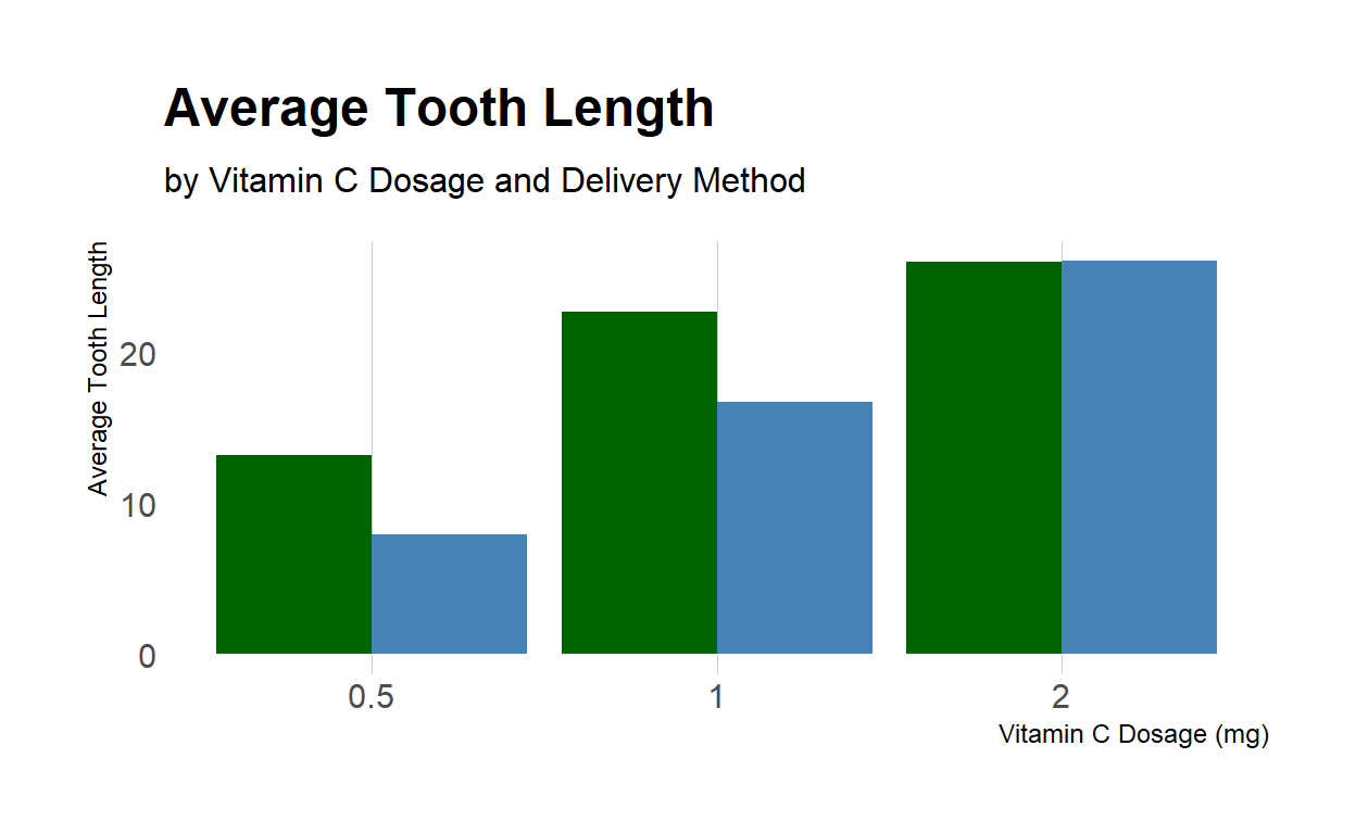
In this chart, there are two bars for each dosage value, one for each delivery method. The height of each bar corresponds to the average tooth length for that combination of dosage and delivery method. The x-axis shows the vitamin C dosage in milligrams, and the y-axis shows the average tooth length. The legend shows the two delivery methods and the corresponding colors used for each method. We can see from the chart that the “Orange Juice” delivery method tends to result in longer tooth growth, particularly at higher dosages.
Creating Bar Chart In SPSS
Here is an example of how to create a vertical bar chart, a horizontal bar chart, a stack bar chart, and a multiple bar chart using SPSS software. For this example, we will use the “Employee Data.sav” sample dataset that comes with SPSS.
Vertical Bar Chart
Open SPSS and load the “Employee Data.sav” dataset.
Select “Graphs” > “Chart Builder” from the top menu.
In the “Gallery” tab, select “Vertical Bar” chart type.
Drag the “Gender” variable to the “Category Axis” field, and the “Salary” variable to the “Values” field.
Click on “OK” to create the chart.
Horizontal Bar Chart
Open SPSS and load the “Employee Data.sav” dataset.
Select “Graphs” > “Chart Builder” from the top menu.
In the “Gallery” tab, select “Horizontal Bar” chart type.
Drag the “Gender” variable to the “Category Axis” field, and the “Salary” variable to the “Values” field.
Click on “OK” to create the chart.
Double Click the chart to enter edit mode.
Click on the “Horizontal” toolbar to change the vertical bar to horizontal.
Stacked Bar Chart
Open SPSS and load the “Employee Data.sav” dataset.
Select “Graphs” > “Chart Builder” from the top menu.
In the “Gallery” tab, select “Stacked Bar” chart type.
Drag the “Gender” variable to the “Category Axis” field, and the “Salary” variable to the “Values” field.
Drag the “Employment Category” variable to the “Stacked Bars” field.
Click on “OK” to create the chart.
Multiple Bar Chart
Open SPSS and load the “Employee Data.sav” dataset.
Select “Graphs” > “Chart Builder” from the top menu.
In the “Gallery” tab, select “Clustered Bar” chart type.
Drag the “Gender” variable to the “Category Axis” field, and the “Salary” variable to the “Values” field.
Drag the “Employment Category” variable to the “Clustered Bars” field.
Click on “OK” to create the chart.
Note: The exact steps for creating these charts may vary slightly depending on the version of SPSS you are using, but the general procedure should be similar. Additionally, it is important to note that the specific chart types used in this example may not always be the most appropriate for the data being analyzed. It is important to consider the nature of the data and the research question being addressed when selecting a chart type.
Pie Chart
A pie chart is a type of graph in which a circle is divided into sectors, each representing a proportion of the whole. The size of each sector is proportional to the corresponding value of the variable being measured. Pie charts are often used to display the relative frequencies or proportions of categorical data.
Single Pie Chart
For example, let’s consider a survey in which people were asked about their favorite fruit. The responses were as follows: 40% of people chose apples, 30% chose bananas, and 30% chose oranges. We can create a pie chart to visually represent these proportions as follows:
Here’s the R code to create the above chart:
# Create a vector with the survey results
fruits <- c("Apples", "Bananas", "Oranges")
percentages <- c(40, 30, 30)

# Create the pie chart
chart5 <- pie(percentages, labels = fruits,
              col = c("red", "yellow", "orange"),
              main = "Favorite Fruits")
This will create a pie chart with three sectors, labeled with the corresponding fruit and colored in red, yellow, and orange, respectively.
NULLMultiple Pie Chart
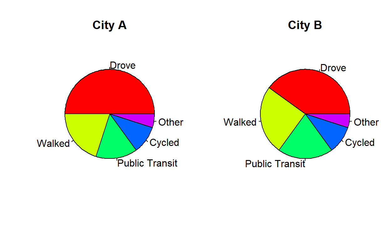
Pie charts can also be used to compare multiple sets of data. For example, let’s consider a survey in which people were asked about their preferred mode of transportation to work. The responses were collected for two different cities. The results are as follows:
City A: 50% drove, 20% walked, 15% took public transportation, 10% cycled, and 5% used other modes of transportation.
City B: 40% drove, 25% walked, 20% took public transportation, 10% cycled, and 5% used other modes of transportation.
We can create a pie chart to visually compare the responses from both cities as follows:
Here’s the R code to create the above chart:
# Create vectors with the survey results for each city
cityA <- c(50, 20, 15, 10, 5)
cityB <- c(40, 25, 20, 10, 5)
modes <- c("Drove", "Walked", "Public Transit", "Cycled", "Other")

# Create the pie charts for each city
chart6 <- pie(cityA, labels = modes, col = rainbow(length(cityA)),
              main = "City A")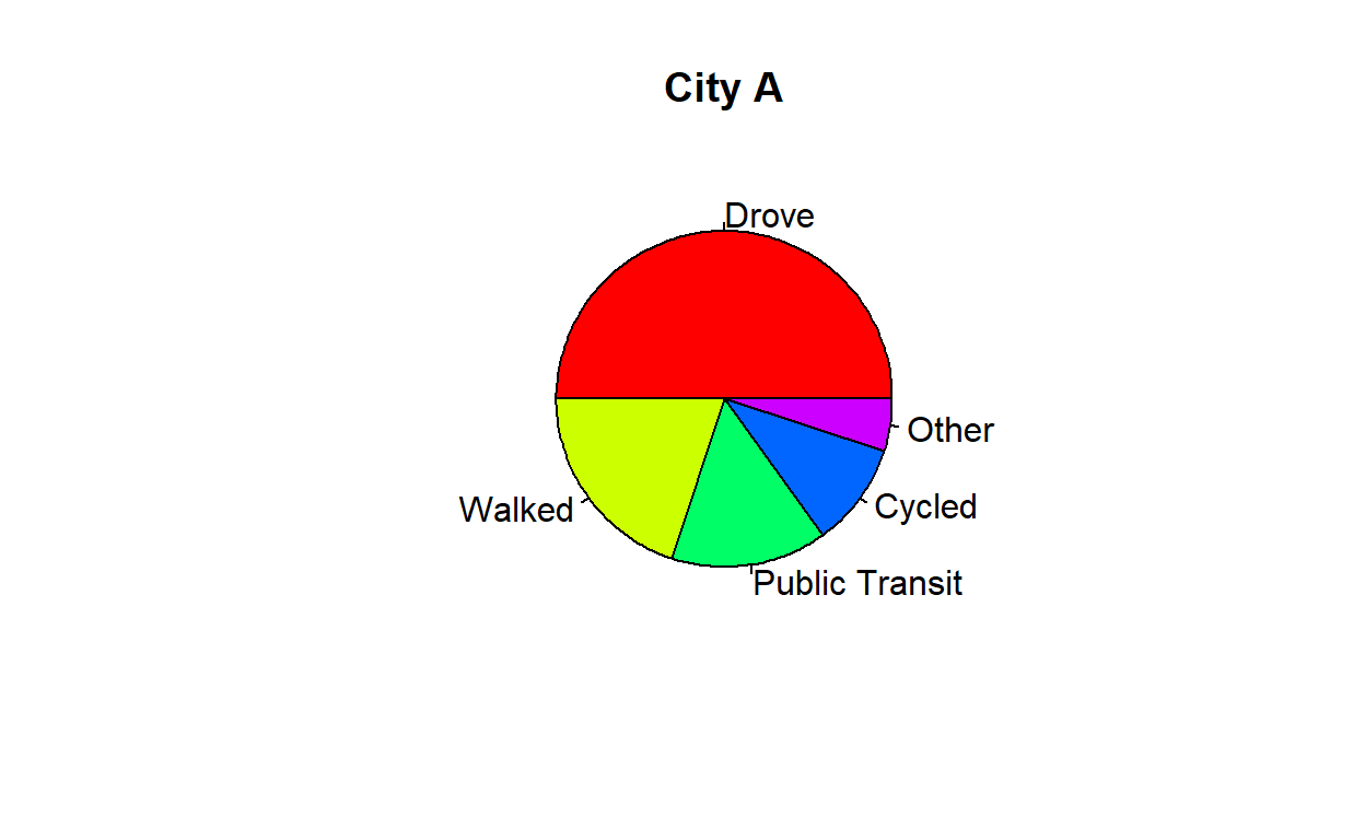

This will create a multiple pie chart with two pie charts side by side, representing the responses from each city. The sectors are labeled with the corresponding mode of transportation and are colored using the rainbow() function to differentiate them.
How to create a Pie Chart?
Let’s consider the following example of a frequency distribution:
| Category | Frequency |
|---|---|
| A | 15 |
| B | 10 |
| C | 5 |
| D | 20 |
| E | 30 |
We can create a pie chart to visually represent the relative frequency of each category as follows:
# Create a vector with the category names and frequencies
categories <- c("A", "B", "C", "D", "E")
frequencies <- c(15, 10, 5, 20, 30)

# Calculate the relative frequencies and angles
relative_freq <- frequencies / sum(frequencies) * 100
angles <- relative_freq / 100 * 360

# Create the pie chart
# This will create a pie chart with five sectors, labeled with
# the corresponding category and colored using the rainbow()
# function to differentiate them.
pie(angles, labels = categories,
    col = rainbow(length(categories)),
    main = "Frequency Distribution")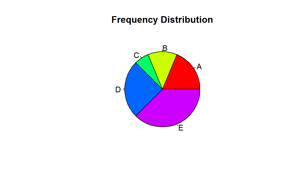
To calculate the relative frequency and angle for each category, we can use the following formulas:
\[\begin{align*} \text{Total frequency} &= \sum \text{Frequency} = 80 \\ \text{category A} &= \frac{15}{80} \times 100\% = 18.75\% \\ \text{category B} &= \frac{10}{80} \times 100\% = 12.5\% \\ \text{category C} &= \frac{5}{80} \times 100\% = 6.25\% \\ \text{category D} &= \frac{20}{80} \times 100\% = 25\% \\ \text{category E} &= \frac{30}{80} \times 100\% = 37.5\% \\ \end{align*}\]\(Relative\ frequency\ =\ \frac{Frequency\ of\ category}{Total\ frequency}\ \times 100%\)
\[\begin{align*} \text{category A} &= \frac{18.75\%}{100} \times 360^\circ = 67.5^\circ \\ \text{category B} &= \frac{12.5\%}{100} \times 360^\circ = 45^\circ \\ \text{category C} &= \frac{6.25\%}{100} \times 360^\circ = 22.5^\circ \\ \text{category D} &= \frac{25\%}{100} \times 360^\circ = 90^\circ \\ \text{category E} &= \frac{37.5\%}{100} \times 360^\circ = 135^\circ \\ \end{align*}\]\(Angle = \frac{Relative\ Frequency\%}{100} \times 360^\circ\)
By combining all the calculation above, we have the following table:
| Category | Frequency | Relative Percentage | Angle (degrees) |
|---|---|---|---|
| A | 15 | 18.75 | 67.5 |
| B | 10 | 12.5 | 45 |
| C | 5 | 6.25 | 22.5 |
| D | 20 | 25 | 90 |
| E | 30 | 37.5 | 135 |
To create the above table in R, use the following code:
# Create the frequency table
freq_table <- data.frame(
  Category = c("A", "B", "C", "D", "E"),
  Frequency = c(15, 10, 5, 20, 30)
)

# Calculate the relative percentage column
freq_table$`Relative Percentage` <-
  freq_table$Frequency / sum(freq_table$Frequency) * 100

# Calculate the angle column
freq_table$`Angle (degrees)` <-
  freq_table$`Relative Percentage` / 100 * 360

# Print the updated frequency table
freq_table
Category Frequency Relative Percentage Angle (degrees)
1 A 15 18.75 67.5
2 B 10 12.50 45.0
3 C 5 6.25 22.5
4 D 20 25.00 90.0
5 E 30 37.50 135.0Stem and Leaf
A stem and leaf plot is a type of data visualization that allows you to easily see the distribution of a dataset. It works by splitting each data point into a “stem” and a “leaf”, where the stem is the first digit or digits of the data point, and the leaf is the last digit.
For example, if we have the following dataset:
12, 15, 17, 21, 22, 25, 27, 32, 34, 36
We would first identify the possible “stems” of the data, which in this case are the tens digits (1, 2, and 3). Then, for each stem, we would list the corresponding “leaves” (i.e. the ones digits) in ascending order. The resulting stem and leaf plot would look like this:
1 | 2 5 7
2 | 1 2 5 7
3 | 2 4 6
Here, the stems are the numbers on the left-hand side of the vertical bar (1, 2, and 3), and the leaves are the numbers on the right-hand side of the vertical bar. The stem and leaf plot allows us to quickly see the distribution of the data: for example, we can see that there are more data points in the 20s than in the 10s or 30s.
To manually construct a stem and leaf plot, follow these steps:
- Identify the possible “stems” of the data, which are the first digit or digits of each data point.
- Write the stems in a vertical column on the left-hand side of the plot.
- For each stem, write the corresponding “leaves” (i.e. the last digit or digits) in a horizontal row to the right of the stem, in ascending order.
Here’s an example of constructing a stem and leaf plot manually, using the dataset from before:
Consider the following data:
\[12, 15, 17, 21, 22, 25, 27, 32, 34, 36\]
The possible stems are the tens digits: 1, 2, and 3.
Write the stems in a vertical column:
1 |
2 |
3 |
For each stem, write the corresponding leaves in a horizontal row to the right of the stem:
1 | 2 5 7
2 | 1 2 5 7
3 | 2 4 6
This gives us the same stem and leaf plot as before.
In summary, the elements of a stem and leaf plot are the stems (which are typically the tens digits), the vertical bar separating the stems from the leaves, and the leaves (which are typically the ones digits). Stem and leaf plots are useful for quickly visualizing the distribution of a dataset and identifying any patterns or outliers.
Example:
Given the following stem and leaf diagram:
4 | 5 6 7
5 | 1 2 4 4 6 7 9
6 | 0 1 4 4 7 8 9
7 | 1 3 3 4 4 4 6 8 9
8 | 2 2 3 3 5 6 8
9 | 0 0 1 3 3 3 3 4 5 5 6 7 9
10 | 0 1 1 1 2 2 2 2 2 3 4 5 5 6 7 9
Legend: 4 | 5 = 45Note that we simply read off the numbers from the stem and leaf diagram, and combined them into a single list. Thus, listing the raw data we obtained the following:
45, 46, 47, 51, 52, 54, 54, 55, 56, 57, 59, 60, 61, 64, 64, 67, 68, 69, 71, 73, 73, 74, 74, 74, 76, 78, 79, 82, 82, 83, 83, 85, 86, 88, 90, 90, 91, 93, 93, 93, 93, 94, 95, 95, 96, 97, 100, 101, 101, 101, 102, 102, 102, 102, 102, 103, 104, 105, 105, 106, 107, 109
Box-and-Whiskers Plot
A box and whisker plot, also known as a box plot, is a graphical representation of a data set that displays the distribution of the data and highlights any outliers. It consists of a box that spans the interquartile range (IQR) of the data, with a line inside the box marking the median. “Whiskers” extend from the box to the minimum and maximum values of the data that are not considered outliers. Outliers are plotted as individual points beyond the whiskers.
Here’s an example of a box and whisker plot anatomy:
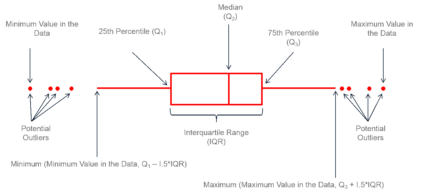
To construct a box and whiskers plot from a raw data set, follow these steps:
- Order the data set from smallest to largest.
- Calculate the median (Q2), first quartile (Q1), and third quartile (Q3) of the data set.
- Calculate the interquartile range (IQR), which is the difference between Q3 and Q1.
- Calculate the lower and upper bounds of the whiskers, which are defined as Q1 - 1.5 * IQR and Q3 + 1.5 * IQR, respectively.
- Plot a box from Q1 to Q3, with a vertical line at the median.
- Draw a whisker from the box to the minimum and maximum values of the data set that are not outliers. Any values outside of the whiskers are plotted as individual points, which are considered outliers.
References:
Freedman, D., Pisani, R., & Purves, R. (2007). Statistics (4th ed.). W.W. Norton & Company.
Moore, D. S., McCabe, G. P., & Craig, B. A. (2017). Introduction to the practice of statistics (9th ed.). W.H. Freeman and Company.